Five Incredible Richard Rogers Buildings
ITALIAN-BORN British architect Richard Rogers has passed away at the age of 88.
Over the course of his life he became one of the world’s most influential architects, known for his state-of-the art modernist designs that helped shift the industry.
Winner of countless awards - including the RIBA Gold medal, Pritzker Prize, Thomas Jefferson Medal and many more - he was without a doubt a titan of British architecture.
After a quick heated debate about Rogers' best work here at The B1M we've arrived at the five projects listed below. Of course there are countless amazing projects and choosing just five is next to impossible.
Special mention must also go to the Lloyds Building and Millennium Dome in London, 3 World Trade Center and the Javits Center in New York City and Terminal 4 at Madrid's Barajas Airport.
Many of these projects made our social media tribute to Rogers shared as the news broke in the early hours of Sunday morning.

Above: The B1M paid tribute to Richard Rogers across its social media platforms on 19 December.
Here they are: just five of Rogers’ incredible buildings and our tribute to a man who truly shaped architecture and construction.
The Leadenhall Building - London
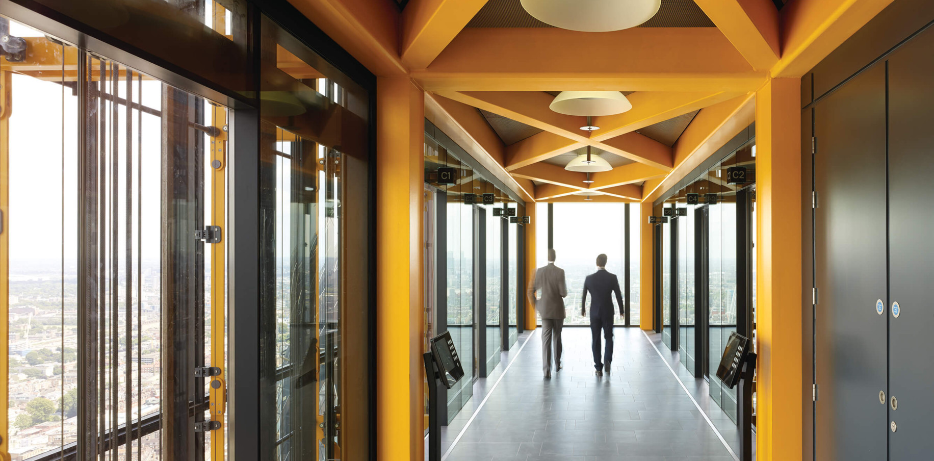
Affectionately dubbed “The Cheesegrater” by the British public, the Leadenhall Building is a work of geometric genius. Rising as a 224.5 metre triangle on the London skyline it redefined the square mile and inspired a slew of copycats - there’s even a second cheesegrater about to be constructed down the road.

Above: The Leadenhall Building reshaped London's skyline. Image courtesy of Rogers Stirk Harbour + Partners.
The building's unique silhouette was actually created out of necessity, prompted by a requirement to respect views of St Paul’s Cathedral, in particular from Fleet Street.
The Richard Rogers’ Drawing Gallery - Marseille
Appearing to float above the French countryside, the Richard Rogers Drawing Gallery is a 120 square metre orthogonal rectangle that's four metres high and five metres wide.

Above: The gallery's floating appearance is the result of an extreme cantilever. Image courtesy of Rogers Stirk Harbour + Partners.
To avoid disturbing the natural landscape and to overcome the sloping nature of the site, the decision was made to dramatically cantilever the structure over the top of the tree canopy.
The gallery is accessed by a lightweight bridge tethered to the ground.
The Urban Living Room - Shenzhen
Although not yet completed, this under-construction master plan promises to redefine the Chinese city of Shenzhen.

Above: The master plan will redefine Shenzhen. Image courtesy of Rogers Stirk Harbour + Partners.
It is being built on an area of reclaimed land and will include a sky-garden that links directly to a number of public transport hubs, a major public space at the water’s edge to be known as Performance Park, an opera house and an International Financial Exchange Centre.
The European Court of Human Rights - Strasbourg
Completed in 1995 the brief for the new European Court of Human Rights was to create a building that was “welcoming and humane, while preserving an appropriate dignity.”
The result is a building that's quintessentially Rogers.

Above: We can see many of Rogers' favourite design signatures continued here. Image courtesy of Rogers Stirk Harbour + Partners.

The two main departments of the court occupy two circular chambers at the head of the building which are clad in stainless steel with aspects that are painted bright red.
We can see the modernist elements Rogers became famous for and included in other designs such as the Lloyds Building in London.
Centre Pompidou - Paris
Perhaps the most famous of Rogers’ buildings, the inside-out Centre Pompidou in Paris defined an architectural movement.
The building was intended to be a cross between “an information-oriented computerised Times Square and the British Museum”, a people-oriented centrepiece for all Parisians.

Above: Centre Pompidou became one of the defining buildings of Rogers' career. Image courtesy of Rogers Stirk Harbour + Partners.
The decision to push the internal elements outside - the pipes, escalators, stairs and so on - was made so that the gallery spaces inside could be on large and uninterrupted open floors.
While the radicalism of the design still provokes the public to this day, it isn’t hard to fall in love with this building.
Our thoughts and best wishes are with the Rogers family and everyone at Rogers Stirk Harbour + Partners.


